Time
May 2024-Present
Activities
UX Research, UX Design, Visual Design,
Brand Identity Design
Role
Design x Tech Member
Tools
Figma, Github, Slack
Background
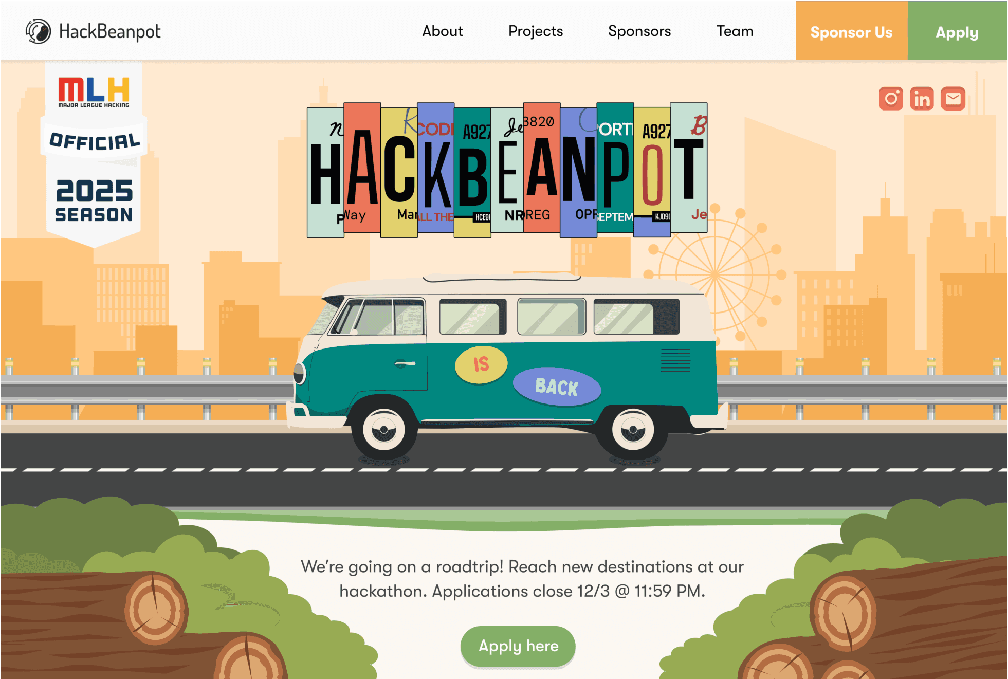
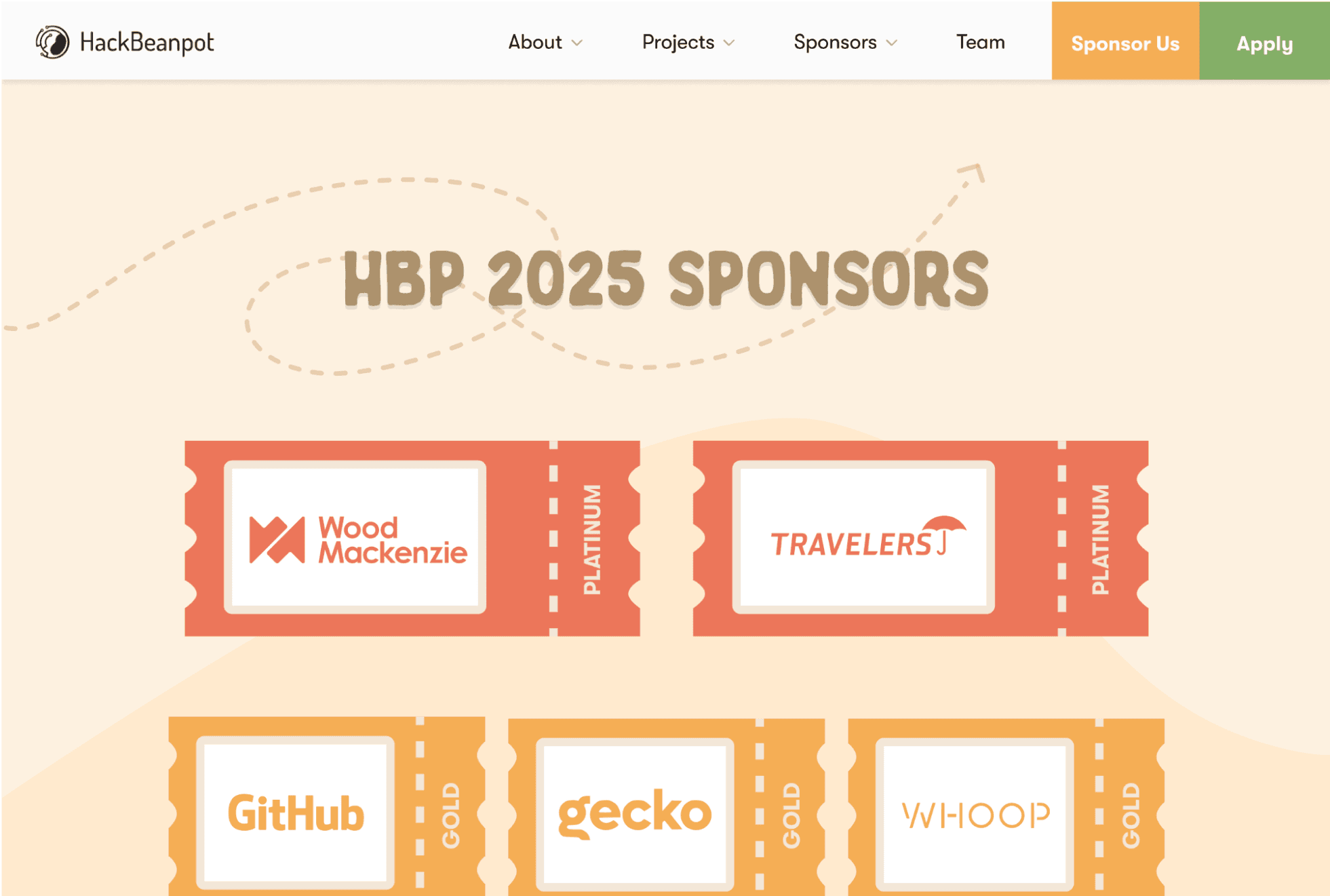
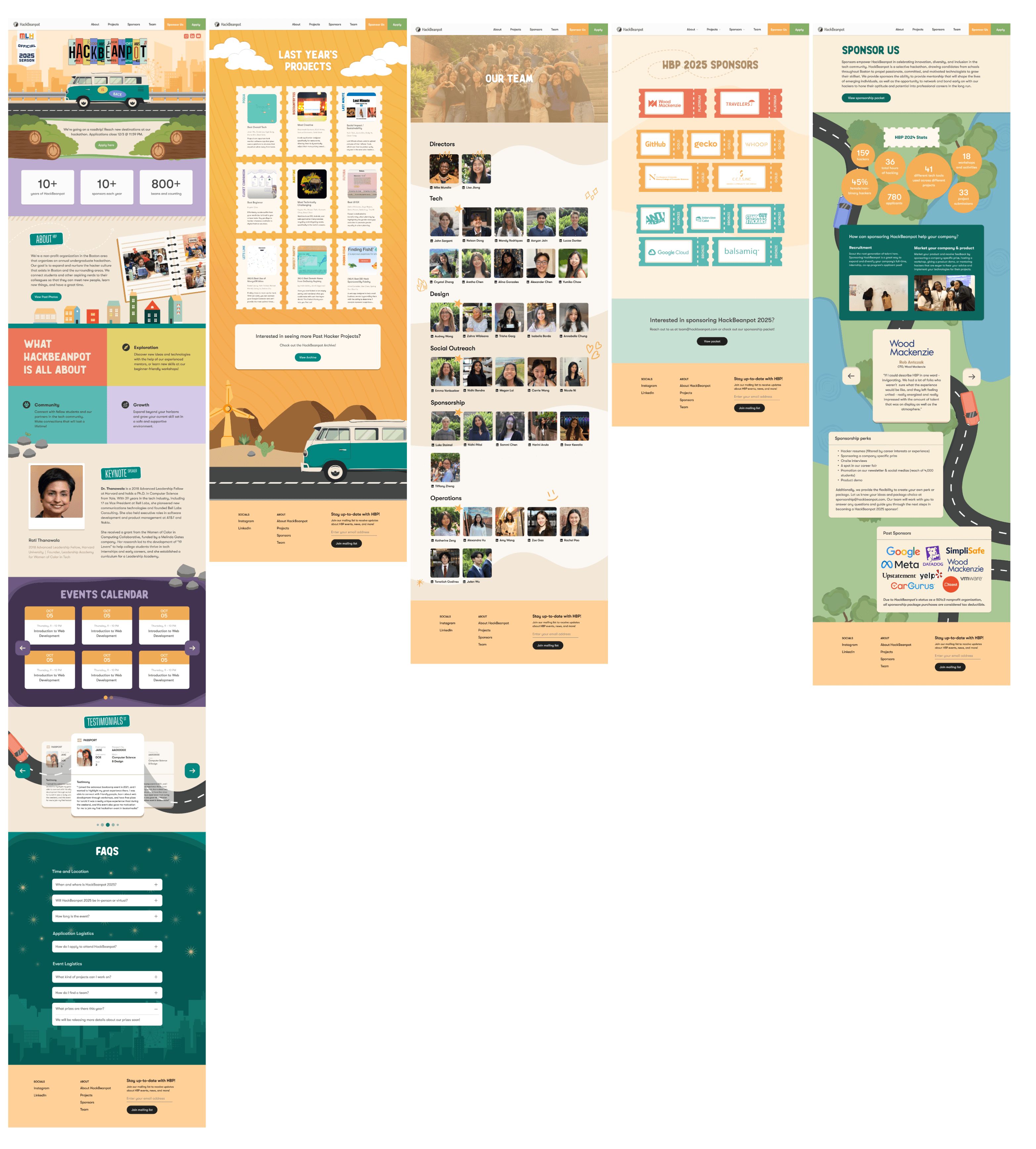
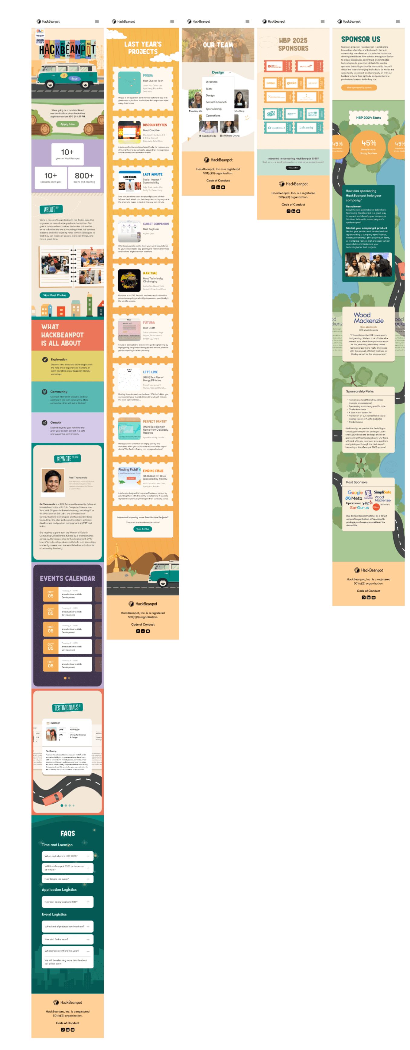
This year, we redesigned the HackBeanpot website using the “Roadtrip” theme. Our goal was to make the site feel like an experience rather than just a set of pages to click through. We changed the format from a single page to multiple pages, which helped organize information more clearly. Each section—About, Projects, Sponsors, and Team—became a “stop” on this road trip, making the site easy to explore while still feeling fun.
01
The Problem
The old website was a single-page design, which made it hard for users to find what they needed quickly. We wanted to make the site clearer and more engaging, so we looked for themes that matched HackBeanpot’s spirit. After considering options like “Videogame” and “Cyberpunk,” we chose “Roadtrip” because it fit best with the idea of a journey and teamwork.
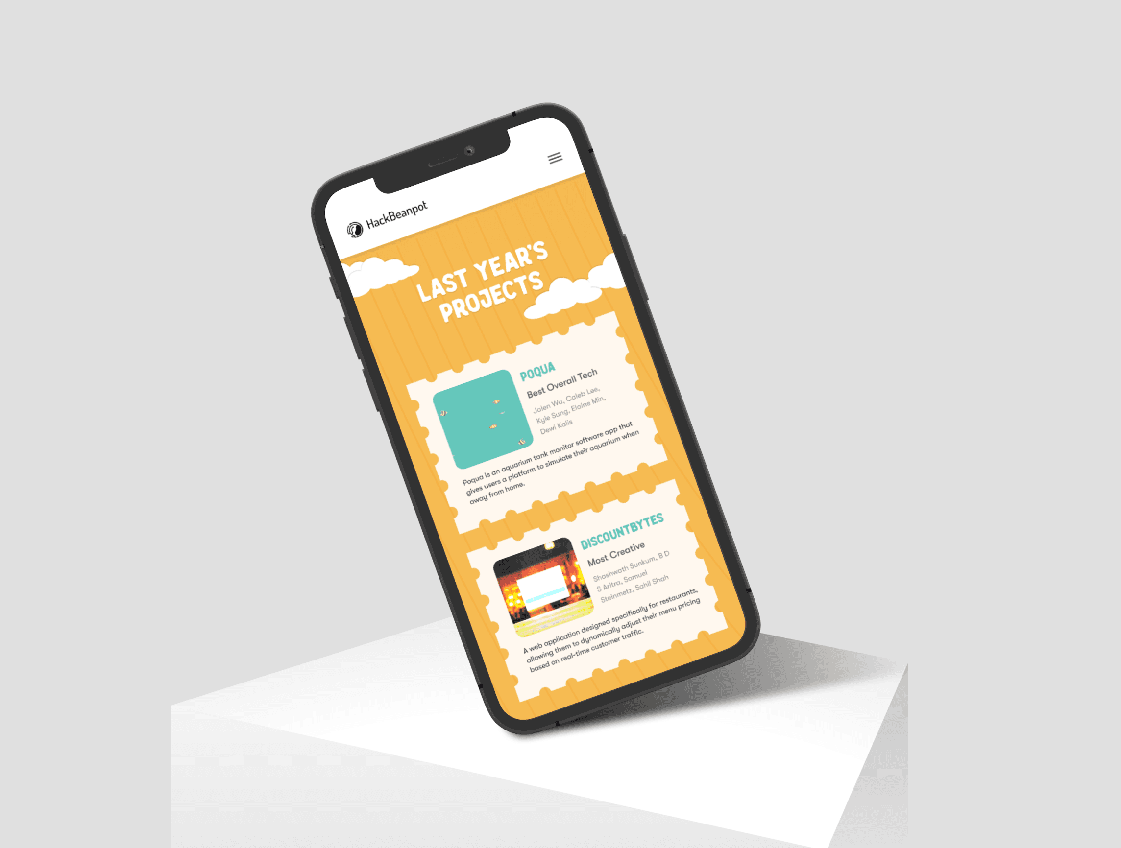
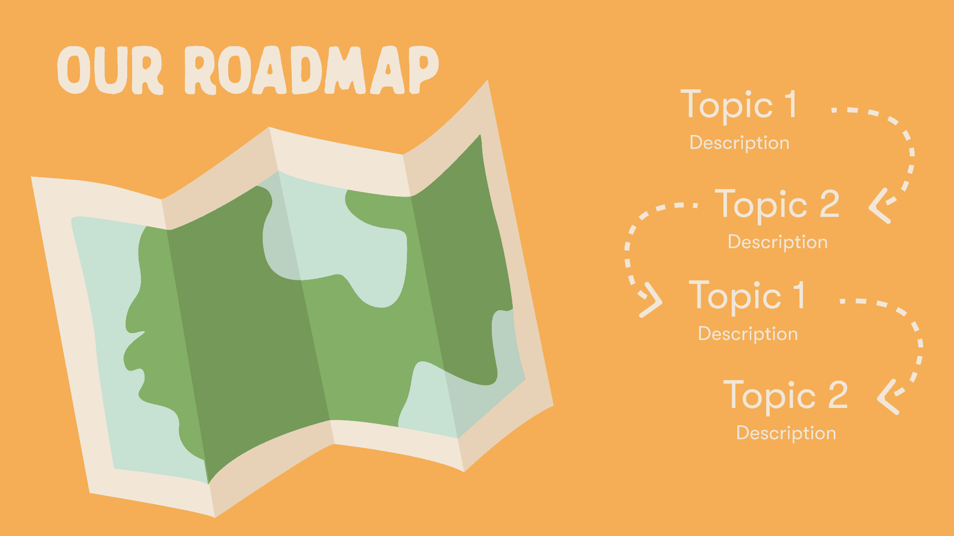
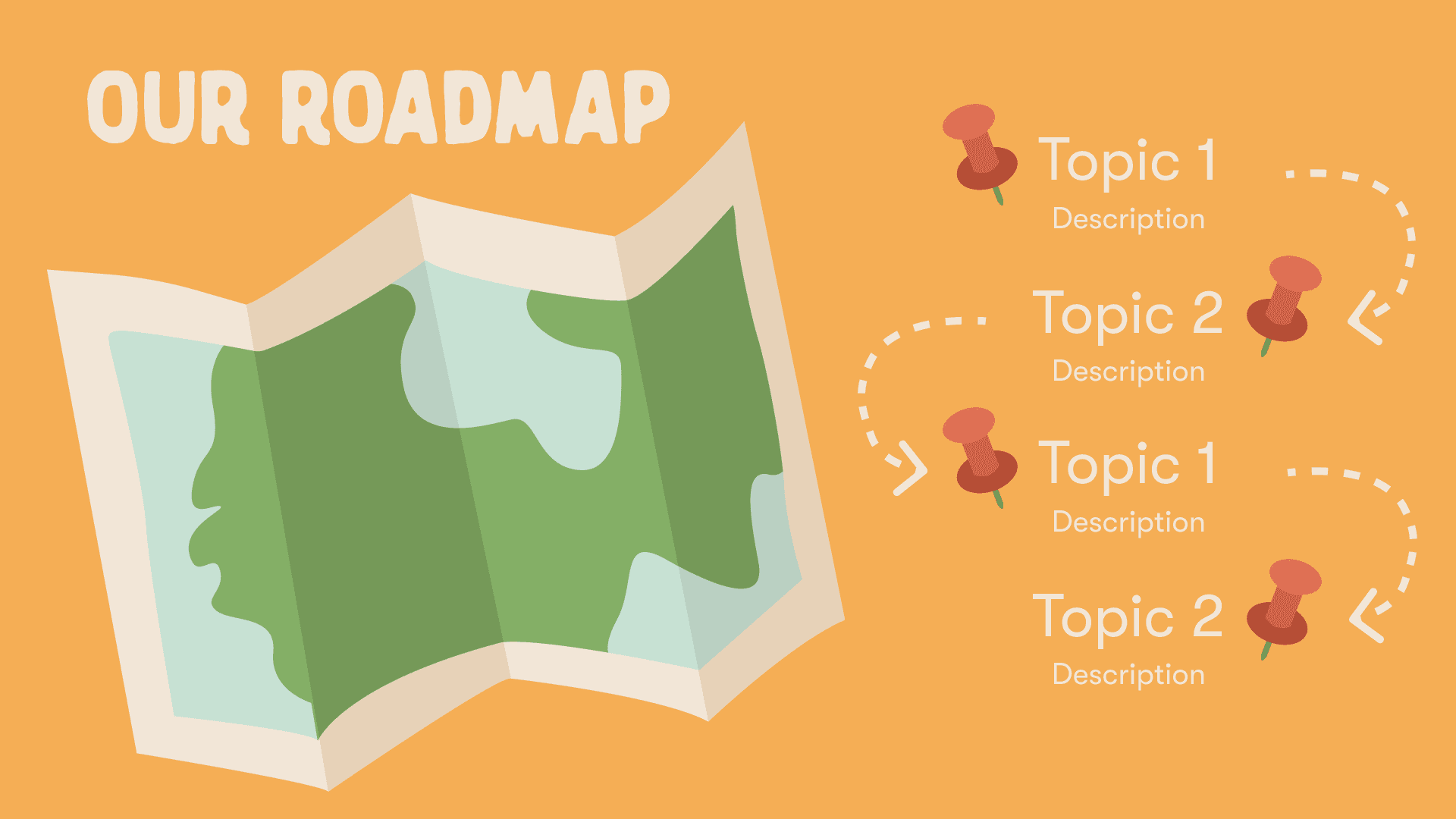
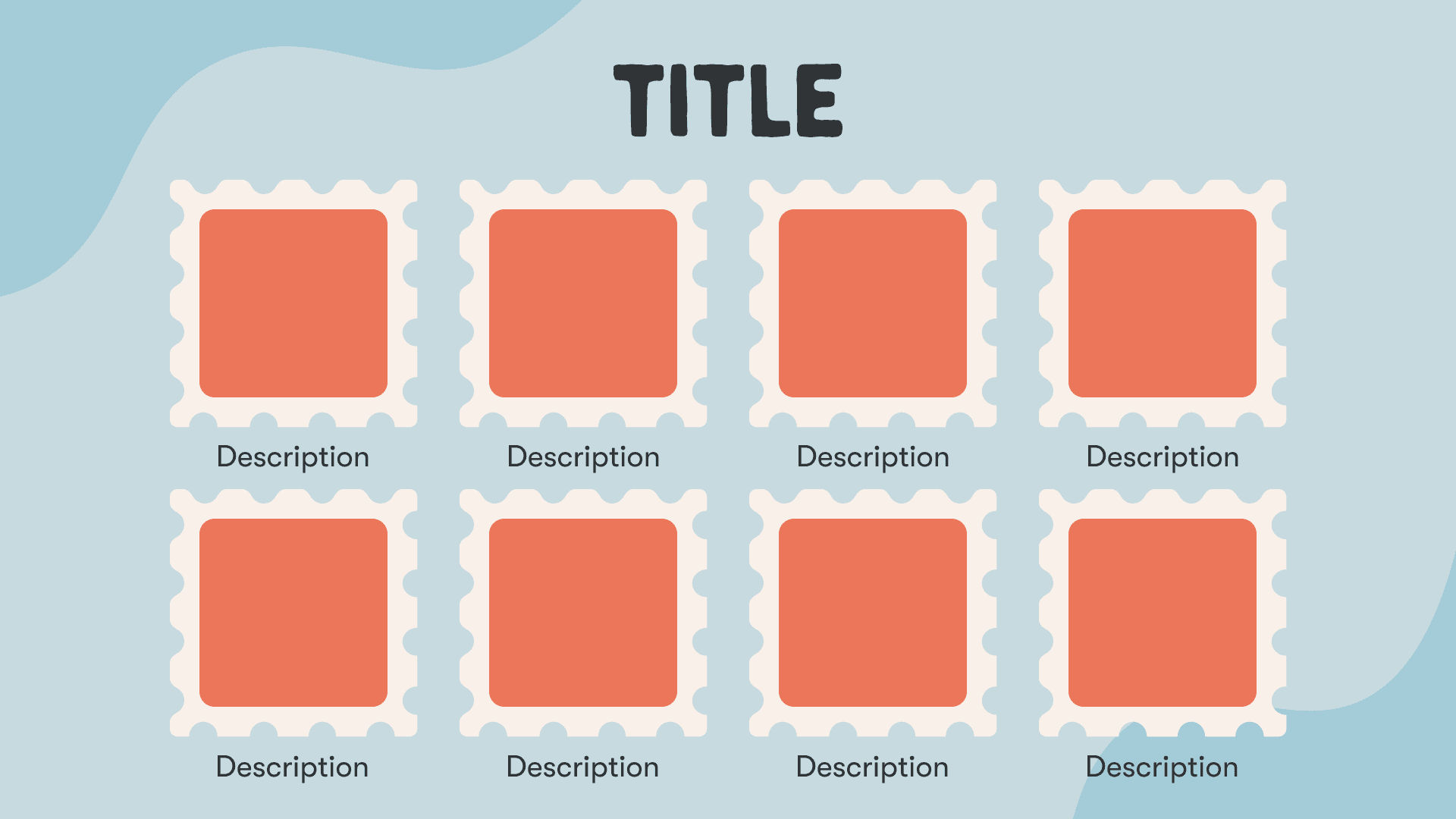
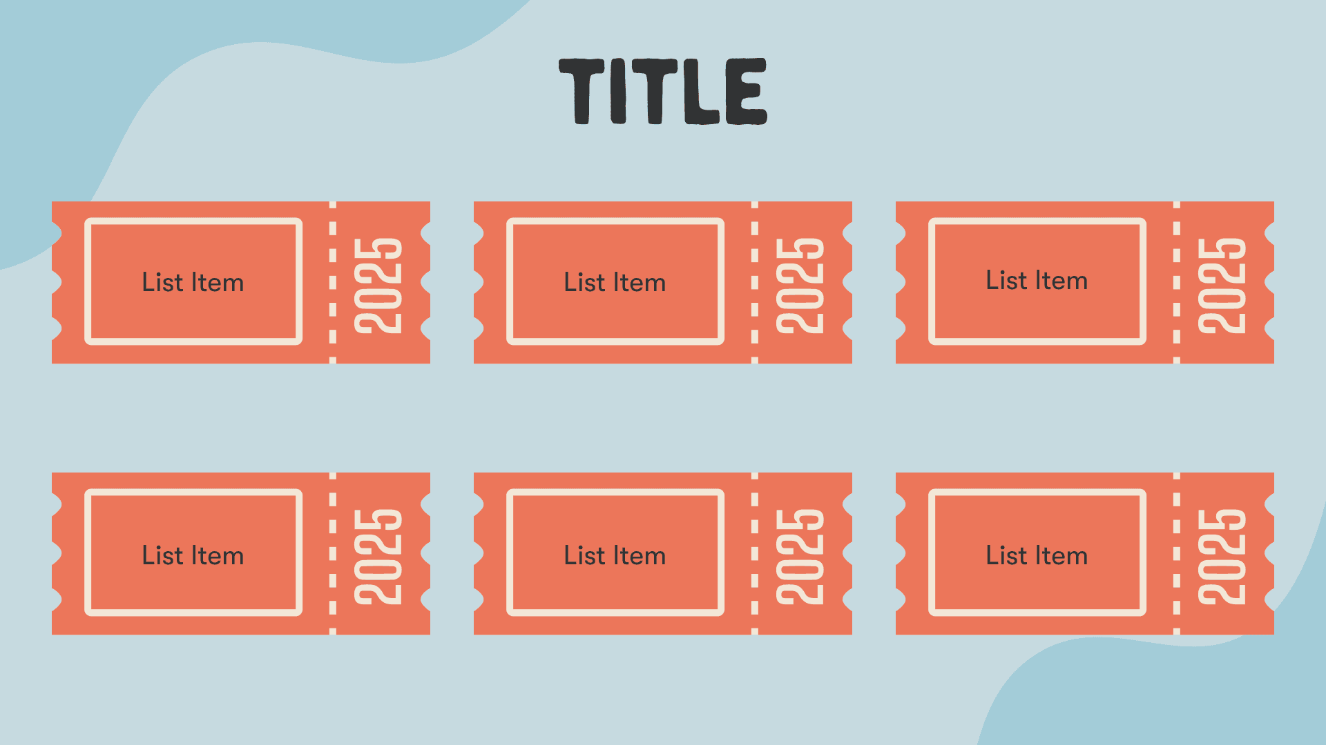
The new design uses travel-themed components, like maps and stamps, to give the sense that visitors are on a journey through the event. This approach makes it easier to navigate and connects to the theme in a simple, relatable way.
02
The Process
We started by researching different themes and thinking about what would work well for our audience. Our main questions were:
How can we make the website easy and fun to use?
What design style would match HackBeanpot’s values of collaboration and adventure?
How can we make the visuals stand out and be easy to remember?
Our research showed that a “Roadtrip” theme would work best. It highlights teamwork and exploration, which are key parts of HackBeanpot. We also wanted to remove clutter, use consistent colors, and make each page a clear step in a journey.

Brainstorming
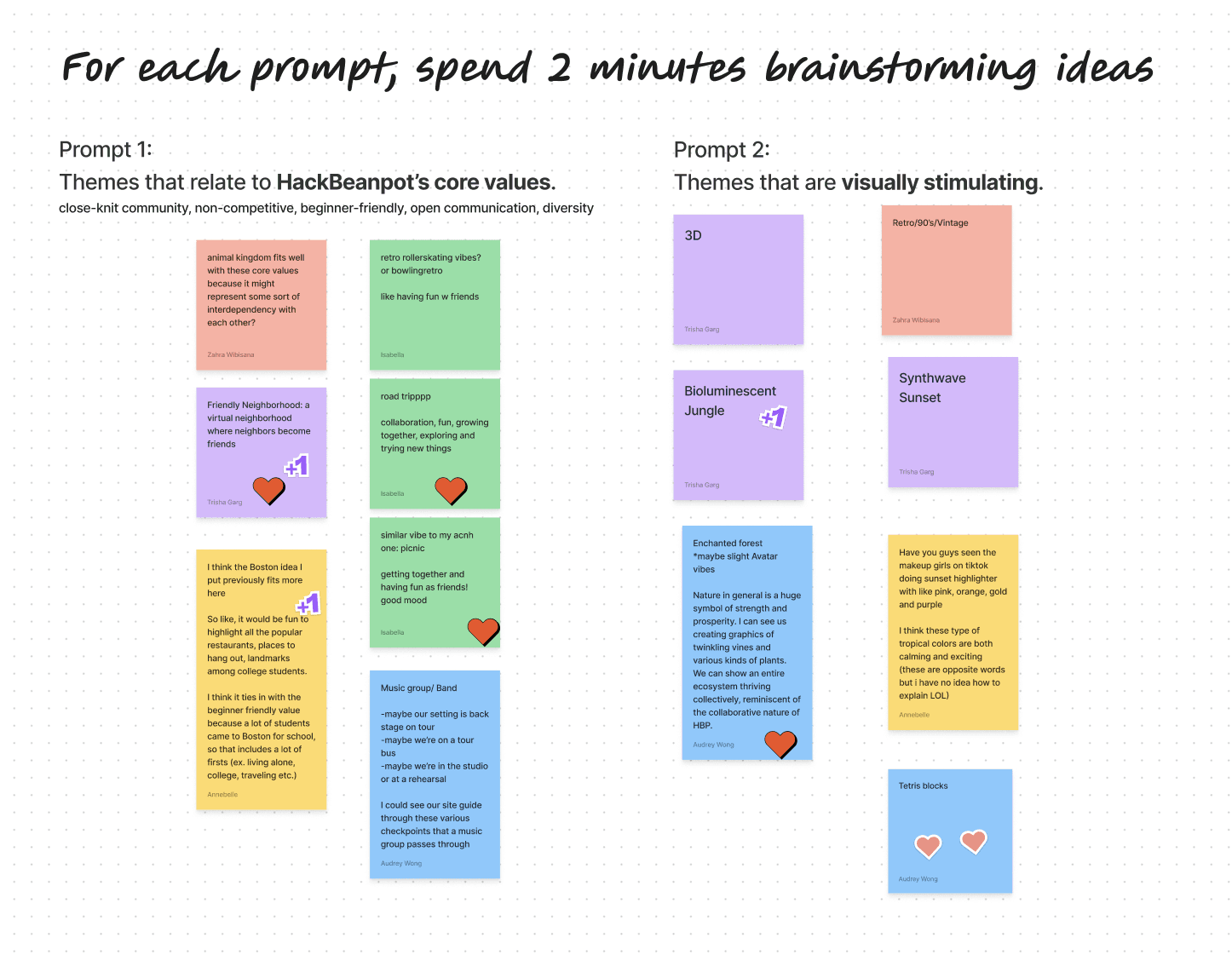
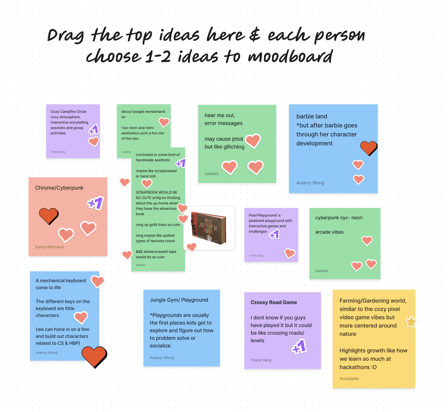
We wanted the theme to feel like an adventure. Ideas like “Jungle Gym” (for a fun, playful feel) and “Cyberpunk” (for a tech-driven vibe) were interesting, but “Roadtrip” made the most sense. It represents teamwork, exploration, and making memories—exactly what we wanted to communicate.

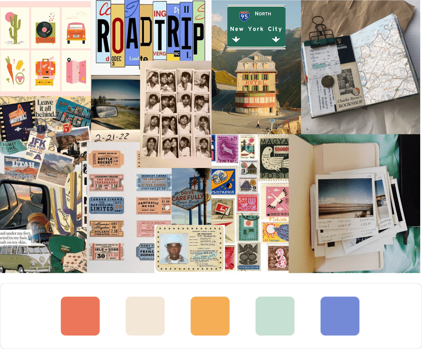
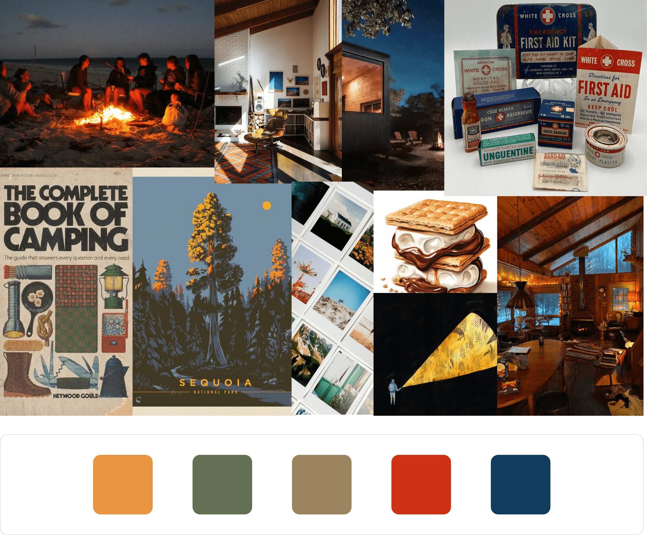


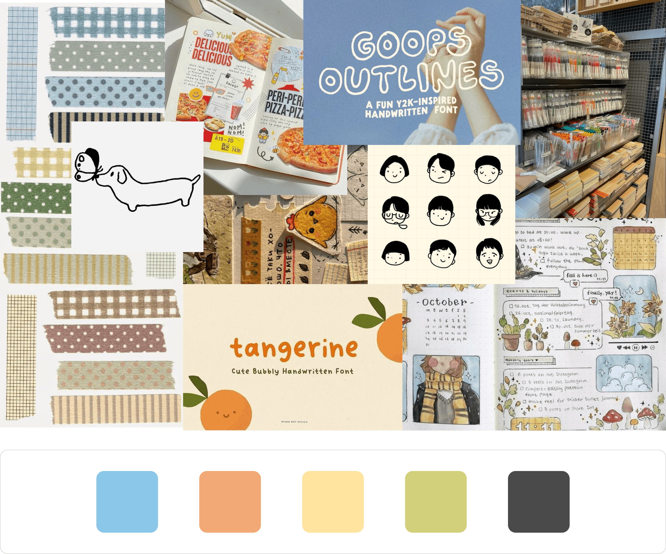
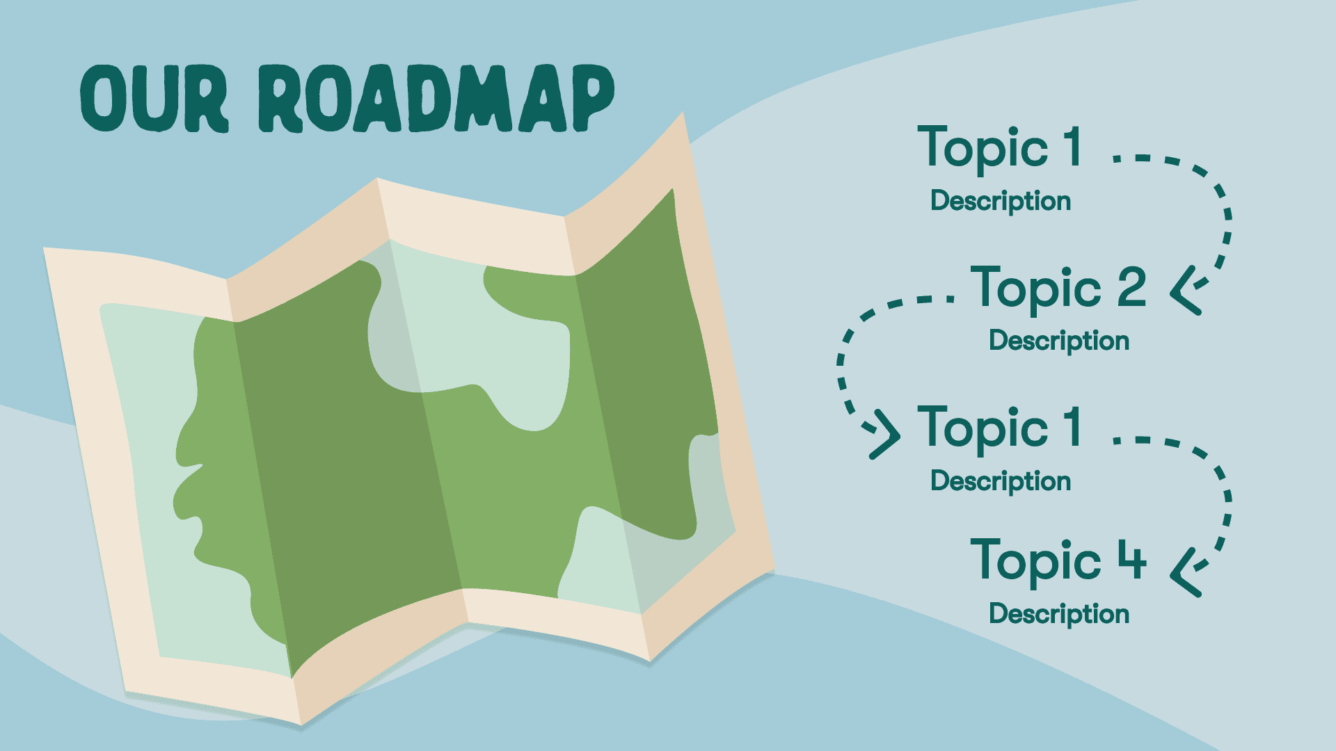
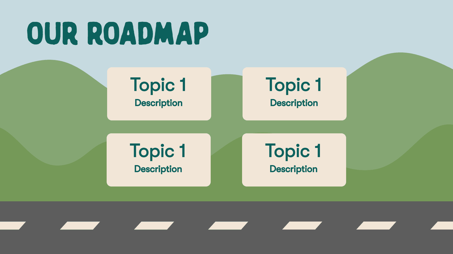
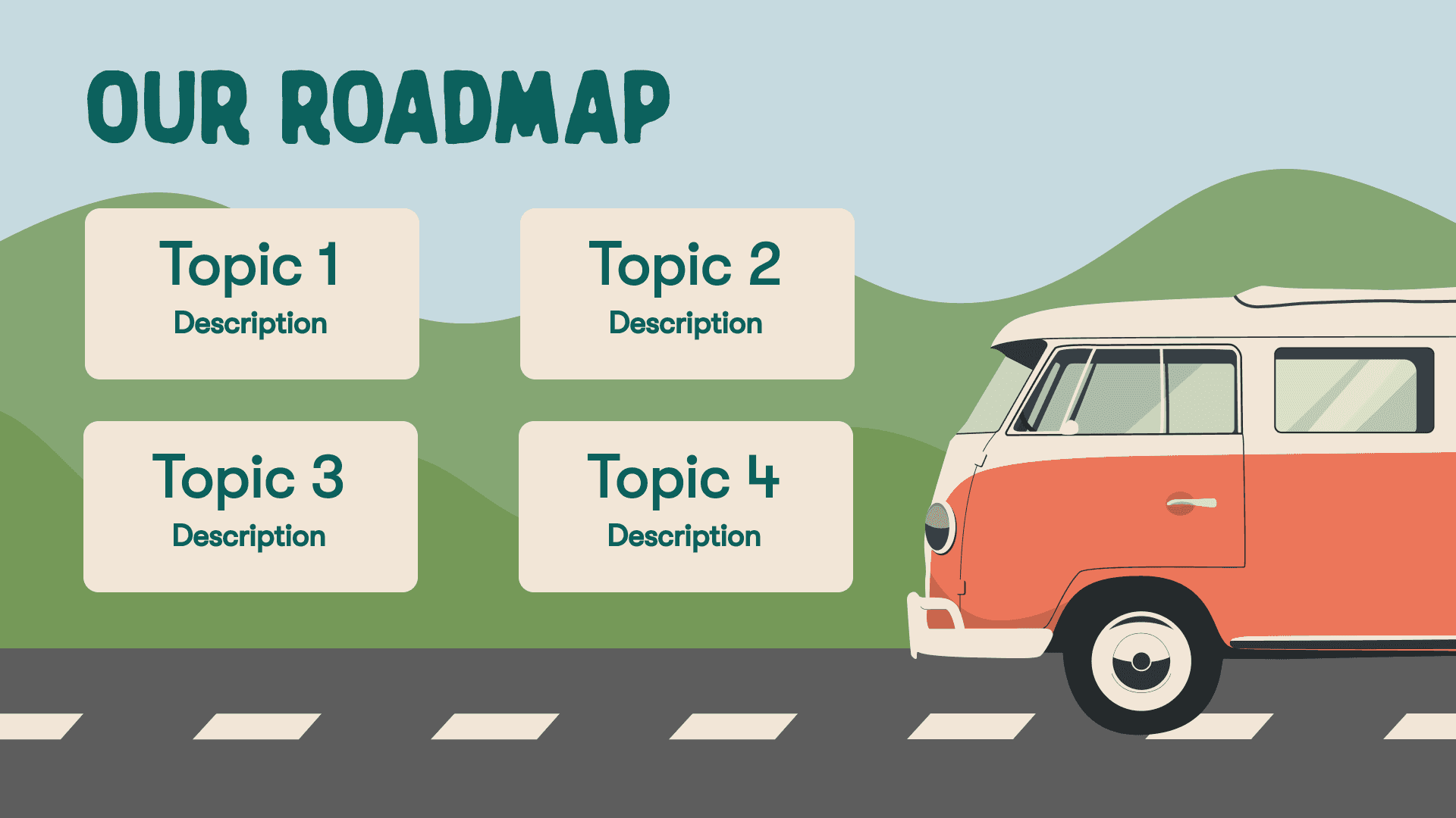
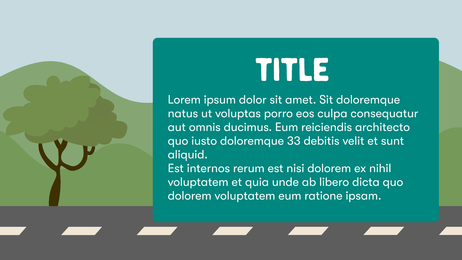
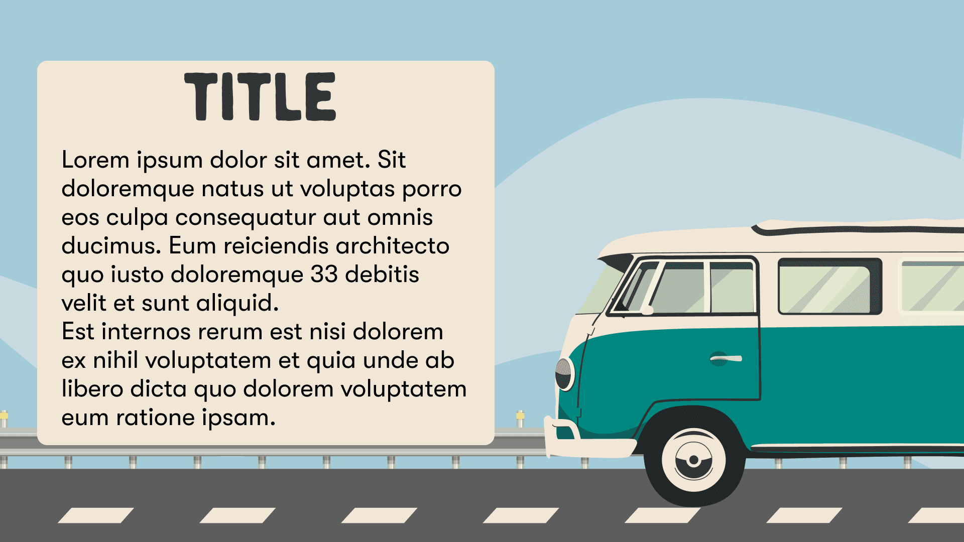
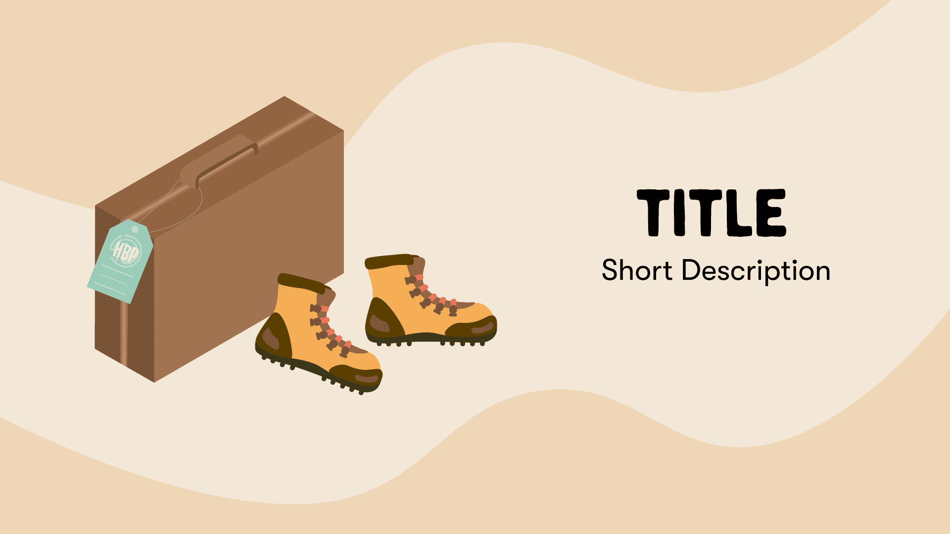
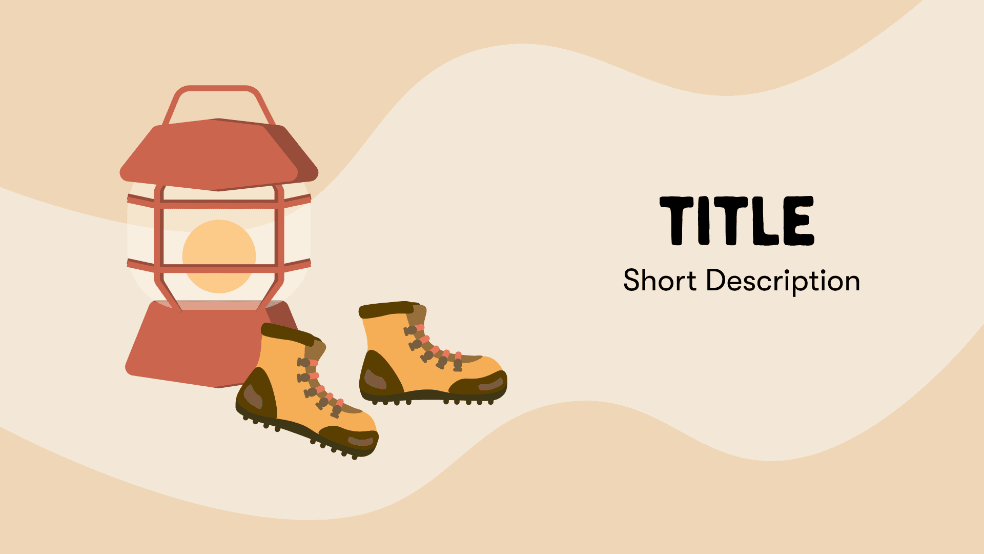
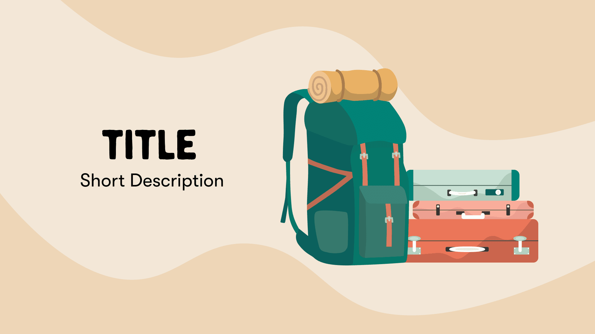
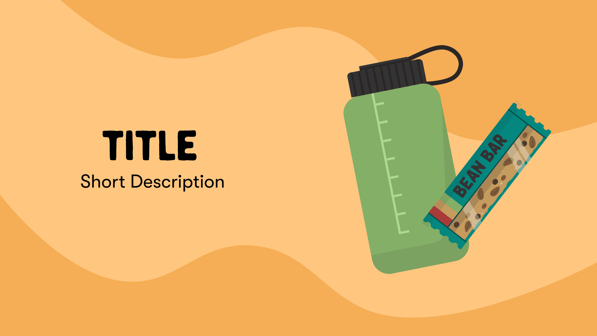
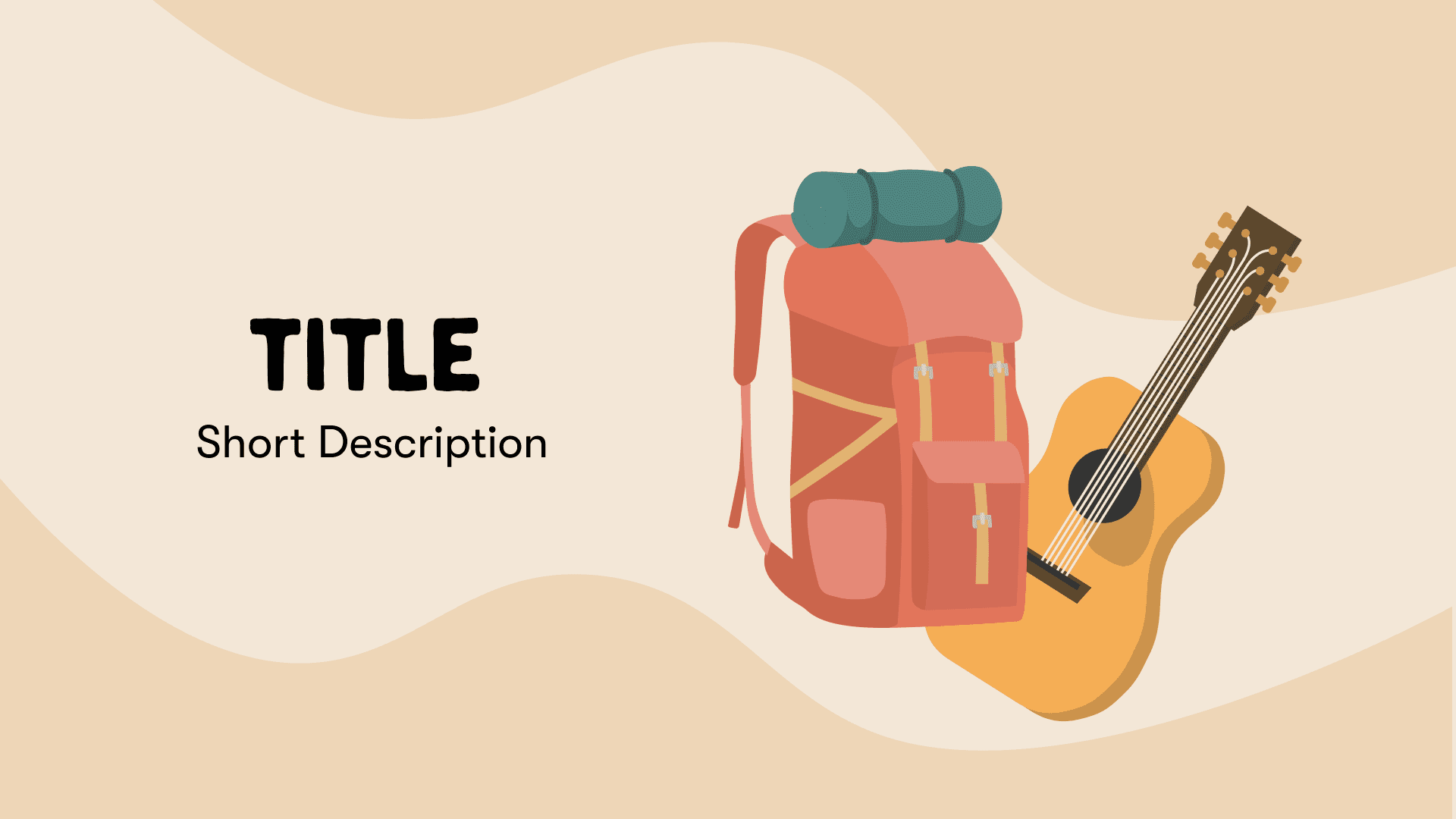
Our visual approach focused on warm, inviting colors and elements that reflect a journey. Icons like cars, maps, and camping gear added to the road trip feel, making the site playful yet purposeful.
Moodboarding
Brand Guide
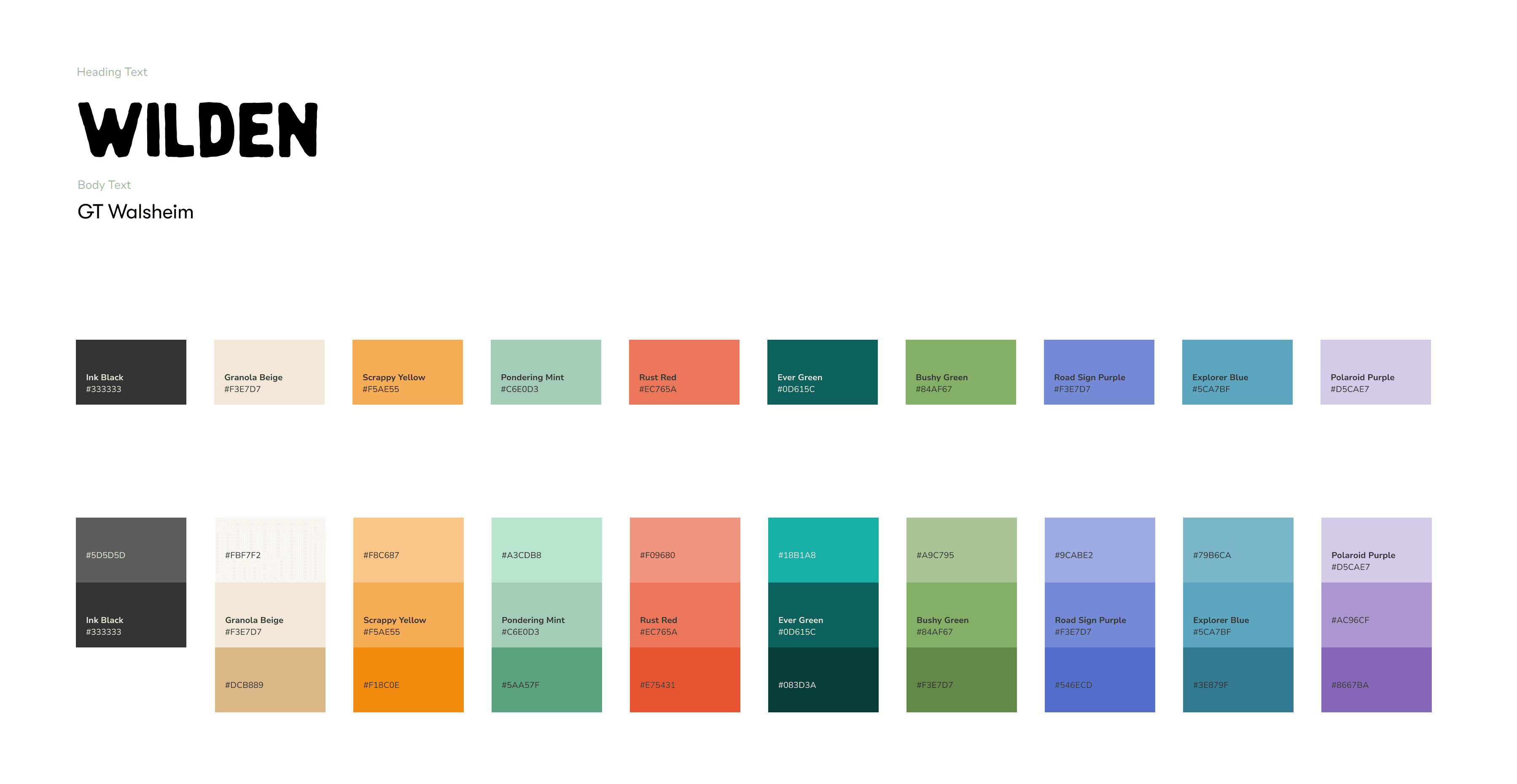
Typography
Bold, friendly headings in ‘Wilden’ make an impact, while ‘GT Walsheim’ keeps body text clear and easy to read.
Color Palette
The colors—‘Granola Beige,’ ‘Pondering Mint,’ and ‘Road Sign Purple’—evoke a sense of warmth and exploration.
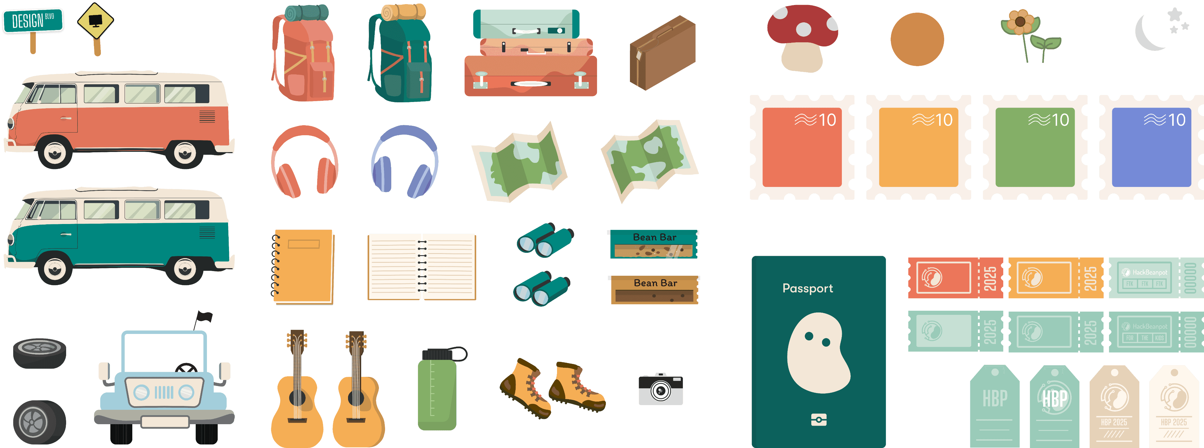
Icons and Illustrations
Icons like cars, maps, and camping gear build on the roadtrip vibe, adding a friendly, engaging feel as users browse.
03
The Solution
We used the “Roadtrip” theme to transform HackBeanpot’s site into an engaging journey. Each section—About, Projects, Sponsors, and Team—was designed as a unique stop on a road trip, encouraging seamless movement from one area to the next. The visuals, including map markers and travel-themed icons, made the site feel inviting and adventurous, with a cohesive color scheme that brought warmth and excitement to the browsing experience.
H
New
P
T
B
Jer
A
Way
K
ALL THE
CODE
B
A927
HCE98
C
Mar
K
E
Jennif
NRM
A
OREG
83820
P
SEPTEM
PORTL
O
A927
KJD90
N
OPR
C
04
Reflection
After presenting the high-fidelity designs to my peers, I received encouraging feedback on how well the "Roadtrip" theme was woven into the HackBeanpot website. They appreciated the playful yet organized elements, noting that the design made navigation feel intuitive while maintaining a cohesive aesthetic. The warm colors and interactive visuals were particularly praised for creating an inviting and engaging user experience.
Time
May 2024-Present
Activities
UX Research, UX Design, Visual Design,
Brand Identity Design
Role
Design x Tech Member
Tools
Figma, Github, Slack
Background
This year, we redesigned the HackBeanpot website using the “Roadtrip” theme. Our goal was to make the site feel like an experience rather than just a set of pages to click through. We changed the format from a single page to multiple pages, which helped organize information more clearly. Each section—About, Projects, Sponsors, and Team—became a “stop” on this road trip, making the site easy to explore while still feeling fun.


01
The Problem
The old website was a single-page design, which made it hard for users to find what they needed quickly. We wanted to make the site clearer and more engaging, so we looked for themes that matched HackBeanpot’s spirit. After considering options like “Videogame” and “Cyberpunk,” we chose “Roadtrip” because it fit best with the idea of a journey and teamwork.

The new design uses travel-themed components, like maps and stamps, to give the sense that visitors are on a journey through the event. This approach makes it easier to navigate and connects to the theme in a simple, relatable way.
02
The Process
We started by researching different themes and thinking about what would work well for our audience. Our main questions were:
How can we make the website easy and fun to use?
What design style would match HackBeanpot’s values of collaboration and adventure?
How can we make the visuals stand out and be easy to remember?
Our research showed that a “Roadtrip” theme would work best. It highlights teamwork and exploration, which are key parts of HackBeanpot. We also wanted to remove clutter, use consistent colors, and make each page a clear step in a journey.


Brainstorming
We wanted the theme to feel like an adventure. Ideas like “Jungle Gym” (for a fun, playful feel) and “Cyberpunk” (for a tech-driven vibe) were interesting, but “Roadtrip” made the most sense. It represents teamwork, exploration, and making memories—exactly what we wanted to communicate.


Our visual approach focused on warm, inviting colors and elements that reflect a journey. Icons like cars, maps, and camping gear added to the road trip feel, making the site playful yet purposeful.
Moodboarding


Brand Guide
Typography
Bold, friendly headings in ‘Wilden’ make an impact, while ‘GT Walsheim’ keeps body text clear and easy to read.
Color Palette
The colors—‘Granola Beige,’ ‘Pondering Mint,’ and ‘Road Sign Purple’—evoke a sense of warmth and exploration.
Icons and Illustrations
Icons like cars, maps, and camping gear build on the roadtrip vibe, adding a friendly, engaging feel as users browse.


03
The Solution
We used the “Roadtrip” theme to transform HackBeanpot’s site into an engaging journey. Each section—About, Projects, Sponsors, and Team—was designed as a unique stop on a road trip, encouraging seamless movement from one area to the next. The visuals, including map markers and travel-themed icons, made the site feel inviting and adventurous, with a cohesive color scheme that brought warmth and excitement to the browsing experience.
H
New
P
T
B
Jer
A
Way
K
ALL THE
CODE
B
A927
HCE98
C
Mar
K
E
Jennif
NRM
A
OREG
83820
P
SEPTEM
PORTL
O
A927
KJD90
N
OPR
C


04
Reflection
After presenting the high-fidelity designs to my peers, I received encouraging feedback on how well the "Roadtrip" theme was woven into the HackBeanpot website. They appreciated the playful yet organized elements, noting that the design made navigation feel intuitive while maintaining a cohesive aesthetic. The warm colors and interactive visuals were particularly praised for creating an inviting and engaging user experience.
Time
May 2024-Present
Activities
UX Research, UX Design, Visual Design,
Brand Identity Design
Role
Design x Tech Member
Tools
Figma, Github, Slack
Background
This year, we redesigned the HackBeanpot website using the “Roadtrip” theme. Our goal was to make the site feel like an experience rather than just a set of pages to click through. We changed the format from a single page to multiple pages, which helped organize information more clearly. Each section—About, Projects, Sponsors, and Team—became a “stop” on this road trip, making the site easy to explore while still feeling fun.


01
The Problem
The old website was a single-page design, which made it hard for users to find what they needed quickly. We wanted to make the site clearer and more engaging, so we looked for themes that matched HackBeanpot’s spirit. After considering options like “Videogame” and “Cyberpunk,” we chose “Roadtrip” because it fit best with the idea of a journey and teamwork.

The new design uses travel-themed components, like maps and stamps, to give the sense that visitors are on a journey through the event. This approach makes it easier to navigate and connects to the theme in a simple, relatable way.
02
The Process
We started by researching different themes and thinking about what would work well for our audience. Our main questions were:
How can we make the website easy and fun to use?
What design style would match HackBeanpot’s values of collaboration and adventure?
How can we make the visuals stand out and be easy to remember?
Our research showed that a “Roadtrip” theme would work best. It highlights teamwork and exploration, which are key parts of HackBeanpot. We also wanted to remove clutter, use consistent colors, and make each page a clear step in a journey.


Brainstorming
We wanted the theme to feel like an adventure. Ideas like “Jungle Gym” (for a fun, playful feel) and “Cyberpunk” (for a tech-driven vibe) were interesting, but “Roadtrip” made the most sense. It represents teamwork, exploration, and making memories—exactly what we wanted to communicate.


Our visual approach focused on warm, inviting colors and elements that reflect a journey. Icons like cars, maps, and camping gear added to the road trip feel, making the site playful yet purposeful.
Moodboarding


Brand Guide
Typography
Bold, friendly headings in ‘Wilden’ make an impact, while ‘GT Walsheim’ keeps body text clear and easy to read.
Color Palette
The colors—‘Granola Beige,’ ‘Pondering Mint,’ and ‘Road Sign Purple’—evoke a sense of warmth and exploration.
Icons and Illustrations
Icons like cars, maps, and camping gear build on the roadtrip vibe, adding a friendly, engaging feel as users browse.


03
The Solution
We used the “Roadtrip” theme to transform HackBeanpot’s site into an engaging journey. Each section—About, Projects, Sponsors, and Team—was designed as a unique stop on a road trip, encouraging seamless movement from one area to the next. The visuals, including map markers and travel-themed icons, made the site feel inviting and adventurous, with a cohesive color scheme that brought warmth and excitement to the browsing experience.
H
New
P
T
B
Jer
A
Way
K
ALL THE
CODE
B
A927
HCE98
C
Mar
K
E
Jennif
NRM
A
OREG
83820
P
SEPTEM
PORTL
O
A927
KJD90
N
OPR
C


04
Reflection
After presenting the high-fidelity designs to my peers, I received encouraging feedback on how well the "Roadtrip" theme was woven into the HackBeanpot website. They appreciated the playful yet organized elements, noting that the design made navigation feel intuitive while maintaining a cohesive aesthetic. The warm colors and interactive visuals were particularly praised for creating an inviting and engaging user experience.
Time
May 2024-Present
Activities
UX Research, UX Design, Visual Design,
Brand Identity Design
Role
Design x Tech Member
Tools
Figma, Github, Slack
Background
This year, we redesigned the HackBeanpot website using the “Roadtrip” theme. Our goal was to make the site feel like an experience rather than just a set of pages to click through. We changed the format from a single page to multiple pages, which helped organize information more clearly. Each section—About, Projects, Sponsors, and Team—became a “stop” on this road trip, making the site easy to explore while still feeling fun.


01
The Problem
The old website was a single-page design, which made it hard for users to find what they needed quickly. We wanted to make the site clearer and more engaging, so we looked for themes that matched HackBeanpot’s spirit. After considering options like “Videogame” and “Cyberpunk,” we chose “Roadtrip” because it fit best with the idea of a journey and teamwork.

The new design uses travel-themed components, like maps and stamps, to give the sense that visitors are on a journey through the event. This approach makes it easier to navigate and connects to the theme in a simple, relatable way.
02
The Process
We started by researching different themes and thinking about what would work well for our audience. Our main questions were:
How can we make the website easy and fun to use?
What design style would match HackBeanpot’s values of collaboration and adventure?
How can we make the visuals stand out and be easy to remember?
Our research showed that a “Roadtrip” theme would work best. It highlights teamwork and exploration, which are key parts of HackBeanpot. We also wanted to remove clutter, use consistent colors, and make each page a clear step in a journey.


Brainstorming
We wanted the theme to feel like an adventure. Ideas like “Jungle Gym” (for a fun, playful feel) and “Cyberpunk” (for a tech-driven vibe) were interesting, but “Roadtrip” made the most sense. It represents teamwork, exploration, and making memories—exactly what we wanted to communicate.


Our visual approach focused on warm, inviting colors and elements that reflect a journey. Icons like cars, maps, and camping gear added to the road trip feel, making the site playful yet purposeful.
Moodboarding


Brand Guide
Typography
Bold, friendly headings in ‘Wilden’ make an impact, while ‘GT Walsheim’ keeps body text clear and easy to read.
Color Palette
The colors—‘Granola Beige,’ ‘Pondering Mint,’ and ‘Road Sign Purple’—evoke a sense of warmth and exploration.
Icons and Illustrations
Icons like cars, maps, and camping gear build on the roadtrip vibe, adding a friendly, engaging feel as users browse.


03
The Solution
We used the “Roadtrip” theme to transform HackBeanpot’s site into an engaging journey. Each section—About, Projects, Sponsors, and Team—was designed as a unique stop on a road trip, encouraging seamless movement from one area to the next. The visuals, including map markers and travel-themed icons, made the site feel inviting and adventurous, with a cohesive color scheme that brought warmth and excitement to the browsing experience.
H
New
P
T
B
Jer
A
Way
K
ALL THE
CODE
B
A927
HCE98
C
Mar
K
E
Jennif
NRM
A
OREG
83820
P
SEPTEM
PORTL
O
A927
KJD90
N
OPR
C


04
Reflection
After presenting the high-fidelity designs to my peers, I received encouraging feedback on how well the "Roadtrip" theme was woven into the HackBeanpot website. They appreciated the playful yet organized elements, noting that the design made navigation feel intuitive while maintaining a cohesive aesthetic. The warm colors and interactive visuals were particularly praised for creating an inviting and engaging user experience.
Time
May 2024-Present
Activities
UX Research, UX Design, Visual Design,
Brand Identity Design
Role
Design x Tech Member
Tools
Figma, Github, Slack
Background
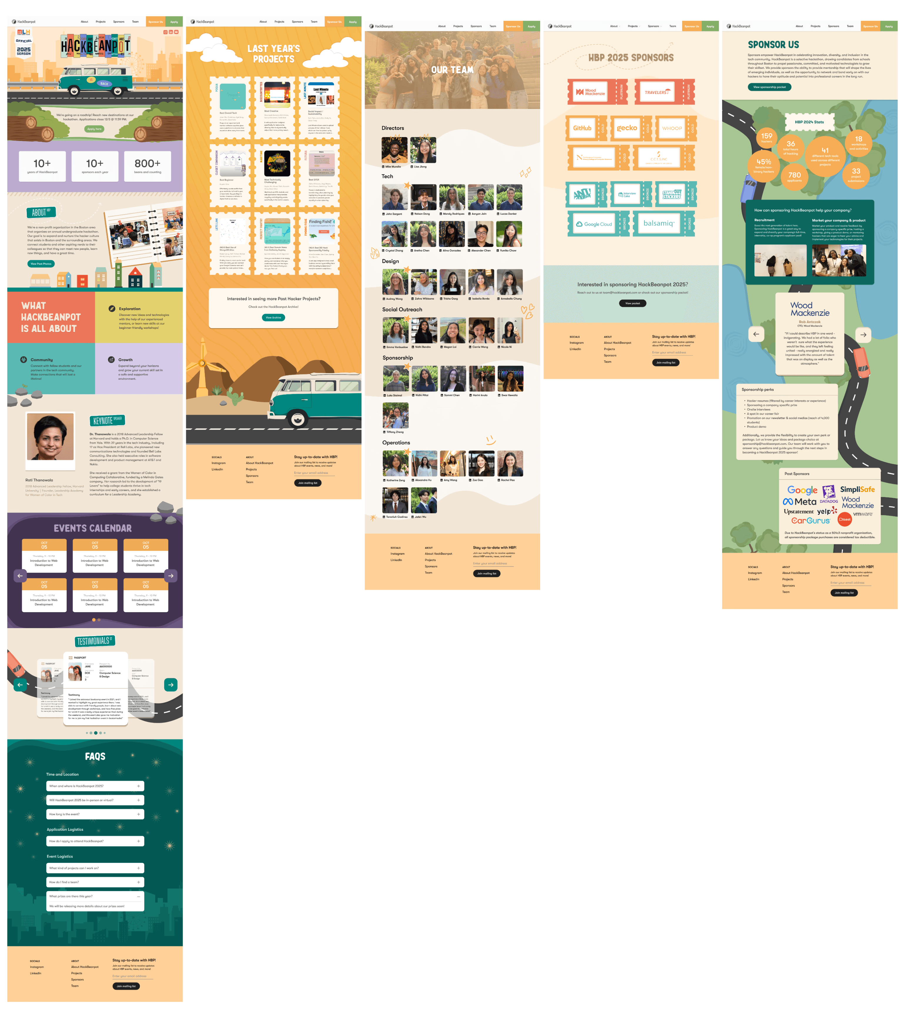
This year, we redesigned the HackBeanpot website using the “Roadtrip” theme. Our goal was to make the site feel like an experience rather than just a set of pages to click through. We changed the format from a single page to multiple pages, which helped organize information more clearly. Each section—About, Projects, Sponsors, and Team—became a “stop” on this road trip, making the site easy to explore while still feeling fun.


01
The Problem
The old website was a single-page design, which made it hard for users to find what they needed quickly. We wanted to make the site clearer and more engaging, so we looked for themes that matched HackBeanpot’s spirit. After considering options like “Videogame” and “Cyberpunk,” we chose “Roadtrip” because it fit best with the idea of a journey and teamwork.
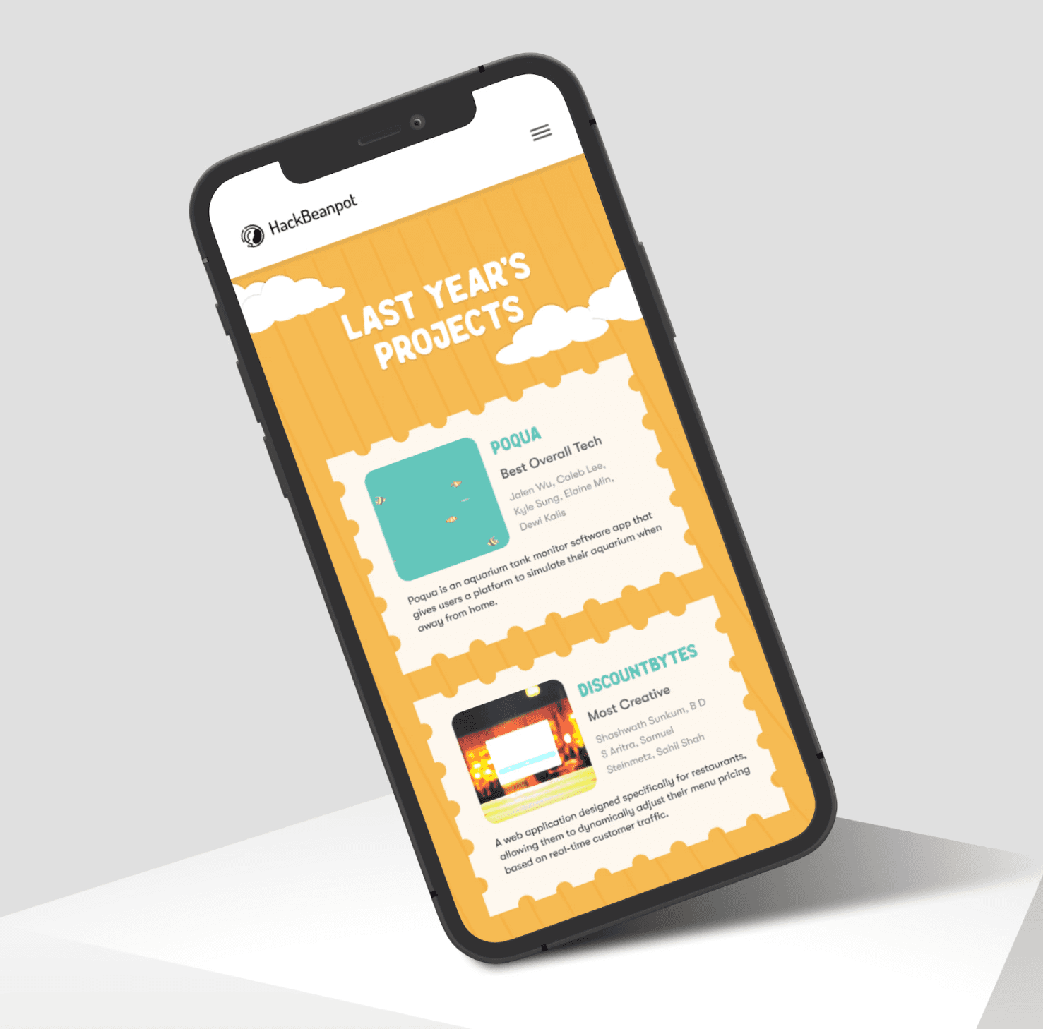
The new design uses travel-themed components, like maps and stamps, to give the sense that visitors are on a journey through the event. This approach makes it easier to navigate and connects to the theme in a simple, relatable way.
02
The Process
We started by researching different themes and thinking about what would work well for our audience. Our main questions were:
How can we make the website fun to use?
What design style would match our values of collaboration and adventure?
How can we make the visuals stand out and be easy to remember?
Our research showed that a “Roadtrip” theme would work best. It highlights teamwork and exploration, which are key parts of HackBeanpot. We also wanted to remove clutter, use consistent colors, and make each page a step in the journey.


Brainstorming
We wanted the theme to feel like an adventure. Ideas like “Jungle Gym” (for a fun, playful feel) and “Cyberpunk” (for a tech-driven vibe) were interesting, but “Roadtrip” made the most sense. It represents teamwork, exploration, and making memories—exactly what we wanted to communicate.


Our visual approach focused on warm, inviting colors and elements that reflect a journey. Icons like cars, maps, and camping gear added to the road trip feel, making the site playful yet purposeful.
Moodboarding


Brand Guide
Typography
Bold, friendly headings in ‘Wilden’ make an impact, while ‘GT Walsheim’ keeps body text clear and easy to read.
Color Palette
The colors—‘Granola Beige,’ ‘Pondering Mint,’ and ‘Road Sign Purple’—evoke a sense of warmth and exploration.
Icons and Illustrations
Icons like cars, maps, and camping gear build on the roadtrip vibe, adding a friendly, engaging feel as users browse.


03
The Solution
We used the “Roadtrip” theme to transform HackBeanpot’s site into an engaging journey. Each section—About, Projects, Sponsors, and Team—was designed as a unique stop on a road trip, encouraging seamless movement from one area to the next. The visuals, including map markers and travel-themed icons, made the site feel inviting and adventurous, with a cohesive color scheme that brought warmth and excitement to the browsing experience.
H
New
P
T
B
Jer
A
Way
K
ALL THE
CODE
B
A927
HCE98
C
Mar
K
E
Jennif
NRM
A
OREG
83820
P
SEPTEM
PORTL
O
A927
KJD90
N
OPR
C

04
Reflection
After presenting the high-fidelity designs to my peers, I received encouraging feedback on how well the "Roadtrip" theme was woven into the HackBeanpot website. They appreciated the playful yet organized elements, noting that the design made navigation feel intuitive while maintaining a cohesive aesthetic. The warm colors and interactive visuals were particularly praised for creating an inviting and engaging user experience.